During this transformation, Ringier Medien approached Brandpulse with the objective of modernizing and unifying the Blick media brand, improving its perception and making it more modern, attractive and fresh – fully embracing the motto: Out with old patterns, in with new forms. Through brand assessment and strategic workshops, in the project’s strategy phase, the need for a comprehensive rebranding, especially in the digital realm, became evident.
Max Buder, Chief Commercial Officer Ringier Medien Schweiz
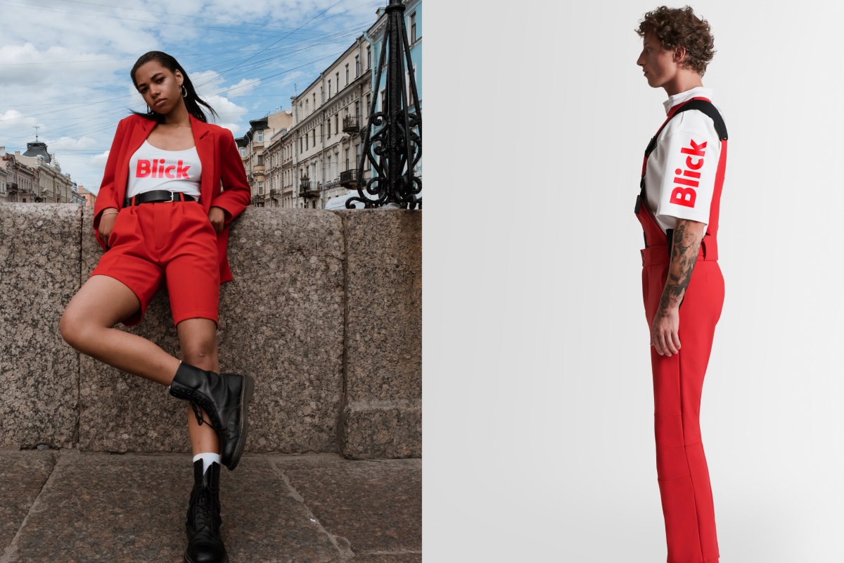
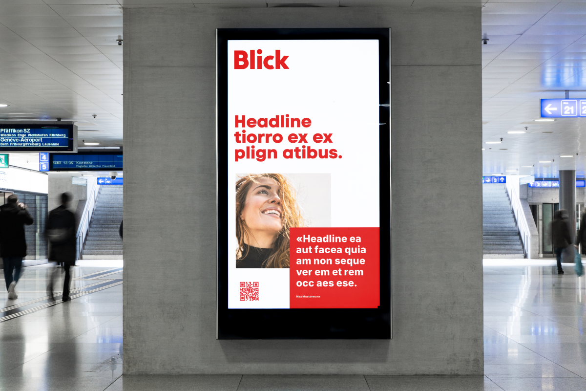
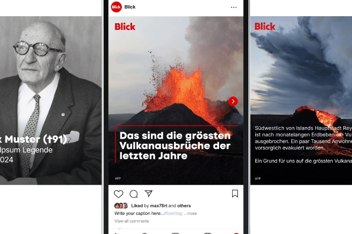
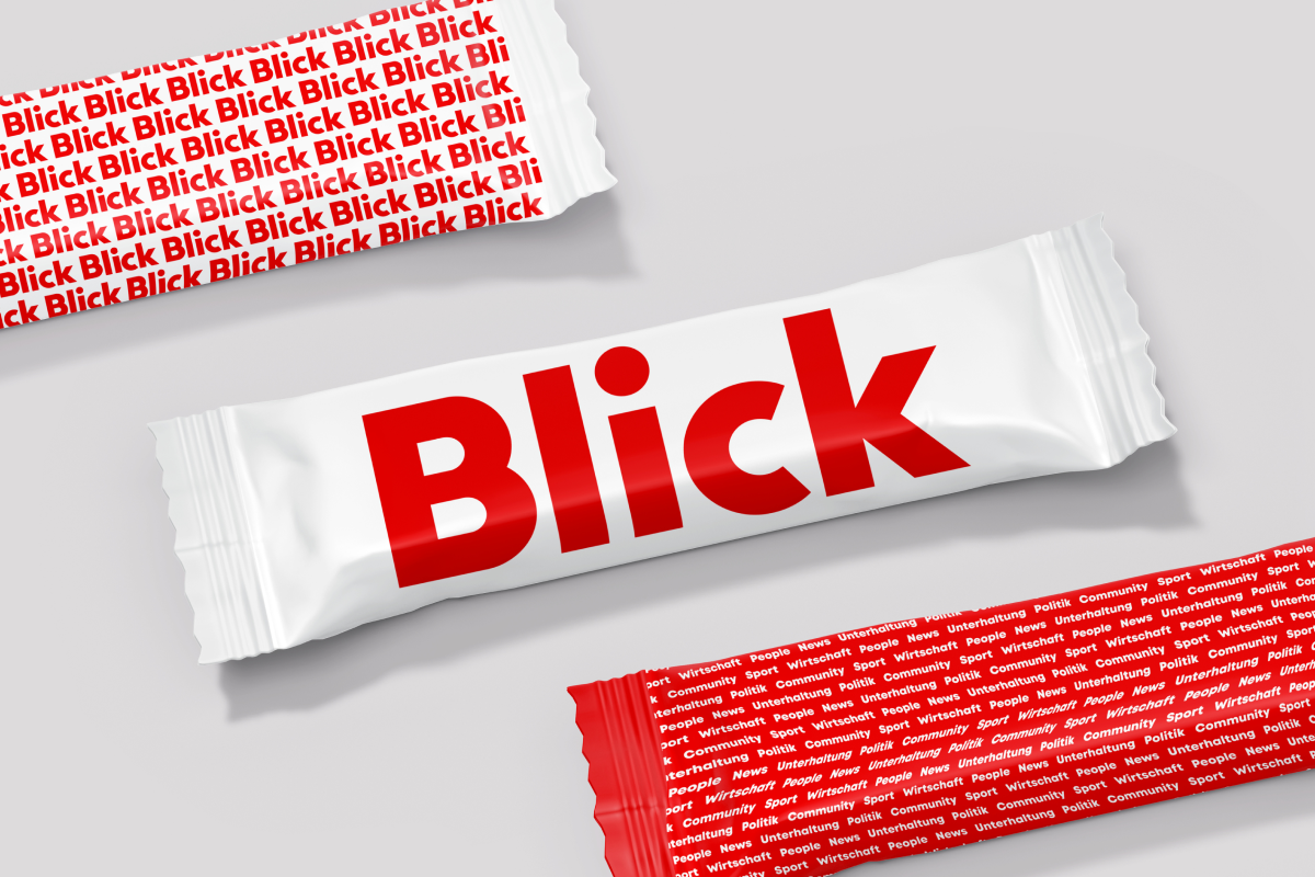
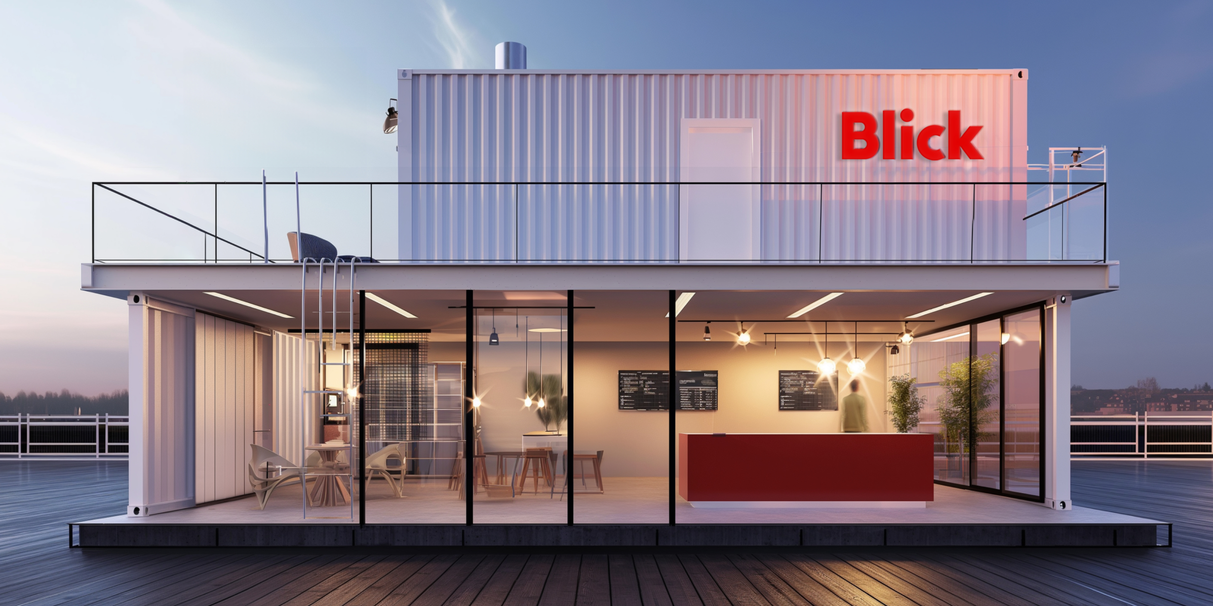
Brandpulse developed a new visual identity that plays with color while retaining red as a distinctive feature of the tabloid medium. The logo was modernized based on the original print logo, removing it from its previous boxed form: Now, it appears on a white backdrop, embodying freshness and impact in its modernity, with a strong focus on its digital application. Brandpulse also completely reimagined the brand’s visual world: The imagery for marketing and self-promotion focuses on people and conveys the essence of “Blick is in the thick of it” through the creative use of colors and warmth.
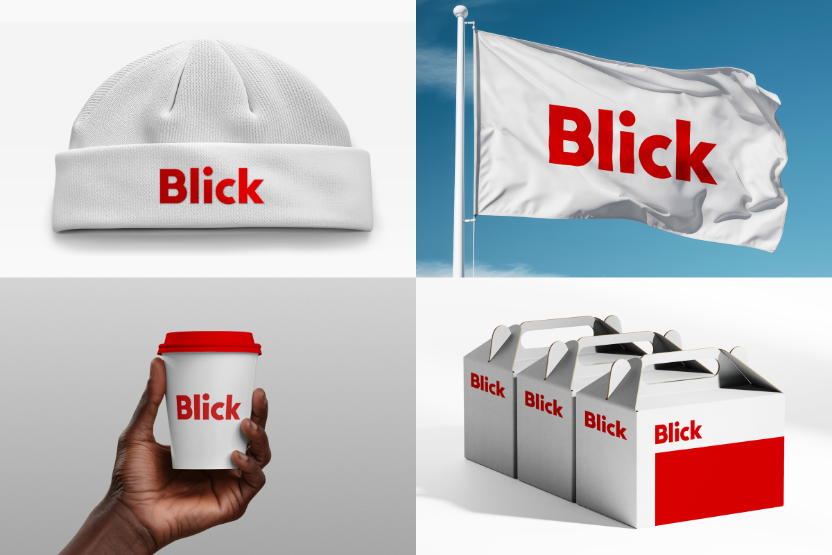
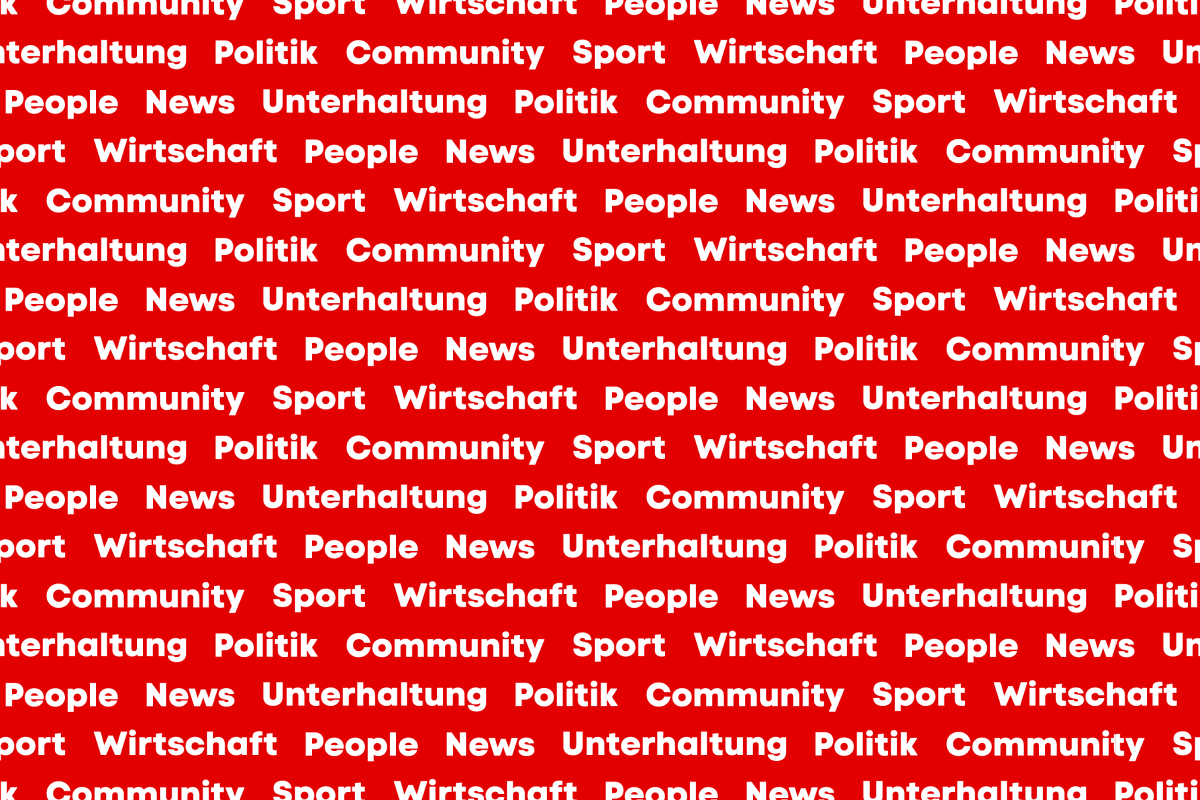
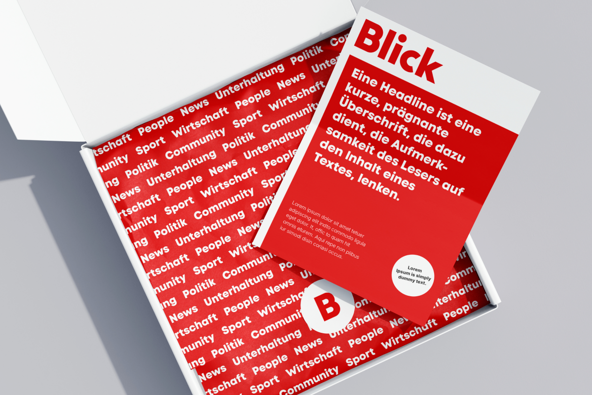
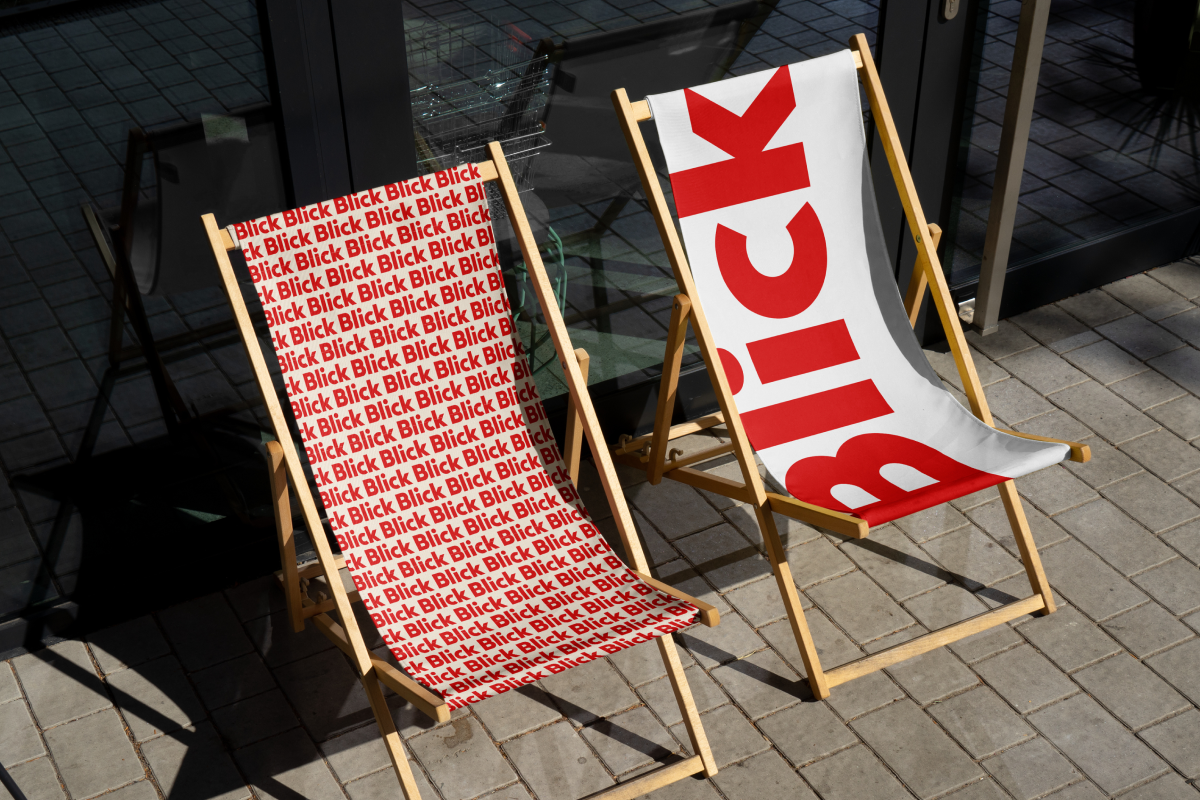
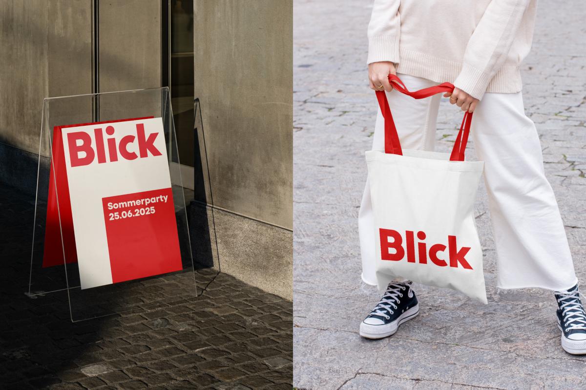
Furthermore, Brandpulse developed a red/white pattern that allows for a playful branding approach. The newly formulated design principles (e.g. for use on football billboards) can be used for both static and animated applications.
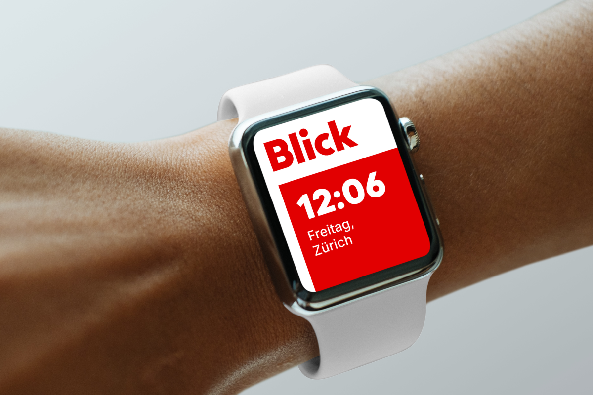
The overall focus was on digital solutions, including motion designs: Brandpulse’s implementations encompass all areas, including the user market, social media, Blick TV and environmental designs for events (such as open airs, film festivals, giveaways, etc.).


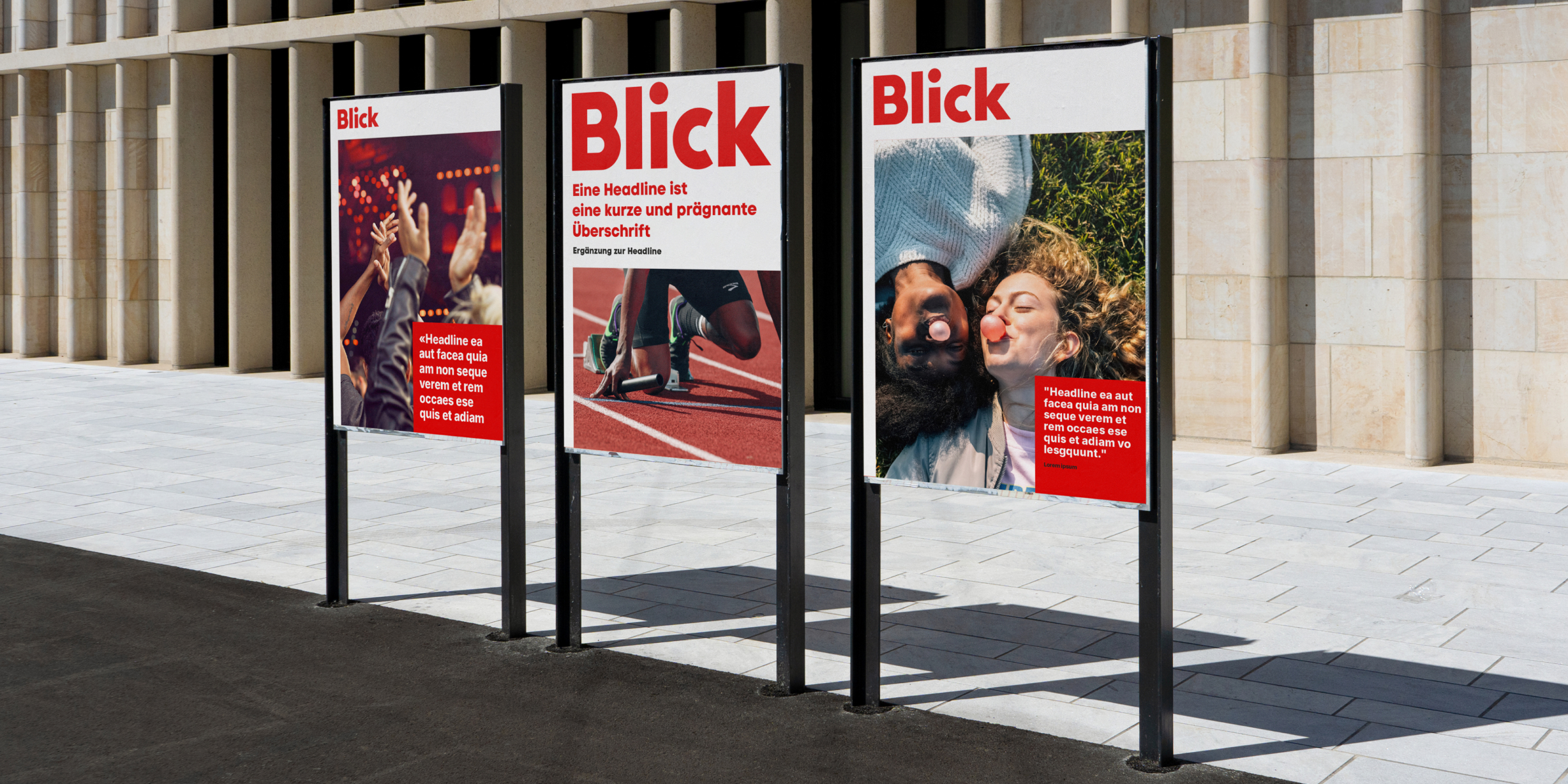
A new typography for both the editorial headlines and marketing campaigns, as well as for the app and online presence, meets all requirements for online readability, line length, and usability in both German and French. Brandpulse also developed a style for icons and layout principles, adopting a fresh approach to the layering concept. The new brand identity, developed by Brandpulse, highlights that Switzerland’s best-known medium consistently delivers information that is close to the people: emotional and contextual.